The Secret to Good Book Design, Production and Layout is knowing what works and what doesn’t. Though there are volumes that I could write on the principles of good design, that is not the purpose of this post. Most people in the publishing industry believe that a good book cover design is a book’s number […]
eBook Cover Design Tutorial: Choosing Colors
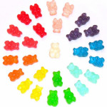
More often than not, the topic of your book helps determine the color theme. For example, a book on babies or weddings use whites or soft pastels; murder mysteries may include red or black; boating, oceans and space science themes utilize blues, blacks or even green.
eBook Cover Design Tutorial: Breaking Down the Elements
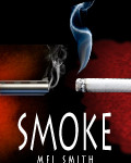
A picture says a thousand words: for an author, it’s more like 120,000 words. The right book cover image is crucial for attracting customers. J.K. Rowlings’ cover art for the book, the Sorcerer’s Stone (Philosopher’s Stone), uses key ingredients to entice, but NOT reveal the story. Breaking down these elements into their basic parts, we can create a list to follow when you are creating your book covers. (This list is by no means definitive; feel free to add or substitute.)
eBook Cover Design Tutorial: Typography and Fonts
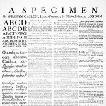
When I was but a young apprentice, my wise Art Director taught me – never create “shlock”. Unfamiliar with this term, I innocently asked what it meant. SCHLOCK (Wikipedia) Schlock is an English word of Yiddish origin meaning “something cheap, shoddy, or inferior.” In other words it means you are settling for something other than […]


